Overview
The 11th Asia-Pacific Knowledge Discovery and Data Mining Conference held a competition where the task was to rank order bank credit card applicants according to their likelihood of subsequently opening a home loan. A financial institution, with the aim of finding better methods for developing cross-sell models, provided the data.
The main reason the particular data set was chosen was the relatively low incidence of the target group in the overall population, or in other words, it was similar to trying to find a needle in a haystack.
47 entries were received from various sources including academia, software vendors, consultancies and in house modelling departments. Each submission included a short description of the methods used.
The reason for this document was my intial query to the competition organiser, Nathaniel Noriel, if a study of the final results would be made, as I would be interested in knowing how a committee of experts model would have performed. After the conclusion of the competition, Nathaniel kindly provided me with the submissions for further analysis.
The quick answer to my query was that a straight average of the top 27 entries would have won the competition and a straight average of the top 40 submissions would have come first runner up. The best solution found was an average of 5 submissions that individually used very different methods. This solution would have won the competition by a significant amount.
This document summarises our findings and will hopefully be of interest to others and provide ideas and stimulus to better improve predictive modelling.
The competition has a web site where more information can be found...
http://lamda.nju.edu.cn/conf/pakdd07/dmc07/
Why the Interest?
1) The Netflix Prize is a movie recommendation competition where the winner (if any) will receive $1million. The experience of participants has been that any individual method of building a model reaches a plateau in predictive accuracy. Competitors using different methods have started getting together to blend their predictions, with the result that 1 + 1 > 2, or the whole is better than the sum of the parts.
2) Techniques such as Bagging where more than one model is built using the same underlying algorithm and then the results averaged to give a final model, are well known. The data here presents probably a unique opportunity for an empirical investigation of a similar idea but with models built completely independently by experts from around the world.
The Big Picture
So diving straight in at the deep end
We are not interested at this point in what the raw data was, or how the individual entrants arrived at their solutions. All we know are that there are 47 solutions where each has applied a score to one of 8,000 customers.
In these 8,000, there exist 350 that are the group we are trying to identify. The solutions are evaluated by their ability to identify this target group in such a way that when they are rank ordered according to their score, the 350 should be towards the top of the list. This model evaluation metric is called the area under the receiver operating curve (AUC). In the following plots, the Gini coefficient is displayed as the metric for model accuracy. These are basically one and the same as AUC = (0.5 * Gini) + 0.5.
We took the top 36 of the 47 entries that we considered as intended results. There was some obvious testing of the system or unseen data issues as several of the entries were no better than random selection.
These 36 were combined in numerous ways to form 'committees' and an average rank order taken of each of the 8,000 cases in the particular committee to generate a master rank order, which was then evaluated for fitness.
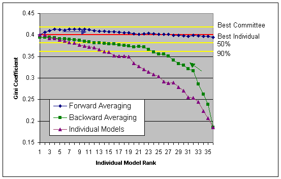
The individual entries are shown above in purple. These are ordered so that the winning entry (the one with the highest gini coefficient) is on the far left.
Committee models were then generated by combining the models placed 1st and 2nd, then 1st, 2nd and 3rd etc. until all 36 models were in the committee. This is the blue line labelled forward averaging.
Similarly, models placed 36th and 35th were combined, then 36th, 35th & 34th etc. until all 36 models were in the committee. This is the green line labelled backward averaging.
We then randomly selected any 5 models and generated a committee score. This process was repeated 100,000 times. The lines in yellow show the best committee found using this method and the Gini score levels that 50% and 90% of the 100,000 committees examined scored above.
If you averaged the 36 submissions, then this would have come first runner up (far right of the forward averaging line or far left of the backward averaging line). For this data, it is quite clear that a committee of experts is a lot safer strategy than trying to pick an individual expert.
What Could Have Been?
The model building dataset contained 40,000 bads and 700 goods. (we will refer to our target group as goods). When the results were released, it was found that there were 350 goods in the 8,000 population, which is disproportionate.
This random allocation of goods is OK as everyone had the same data, but as the number of goods in the data decreases, the more the gini coefficient can bounce around and the more luck can play that a particular distribution will benefit one expert over another.
We re-sampled the data by giving each of the goods a 60% chance of being in the final set. This would basically make a new group having the same proportion of goods and bads as the training data. The gini coefficient of each of the 36 submissions was then calculated based on this subset of data. This was repeated 10,000 times. The logic behind this was to determine what might have been on another day given a different random sampling.
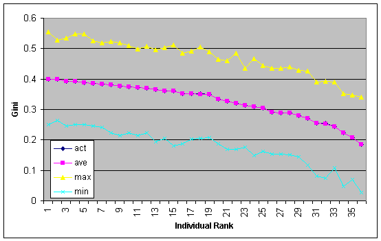
The chart above shows the maximum, minimum and average gini for the 10,000 reduced samples. The actual gini on the full data set is also plotted but mirrors the average gini so is hidden. If we take the maximum gini (yellow line) as what could have been, then it would indicate that the rank ordering is due to superior models as opposed to being lucky on the day. What this chart does show is that when there are low numbers of goods involved, your gini coefficient may be a lot lower (or higher) than expected. This may not necessarily mean that your model is no longer working.
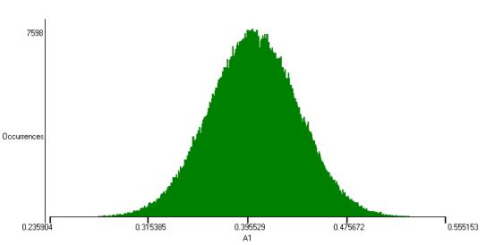
The same process was repeated 1,000,000 times but just for the winning entry. The plot above shows the gini distribution.
More Detail
We discovered earlier that a committee of experts mega model would have been the way to go. Reading the submission reports it became obvious that the real experts already new this.
Most solutions involved combining either several models using variants of the same algorithm and/or different algorithms.
The joint grand champion built models using logistic regression and treenet. They observed:
We compared the area under ROC curve of different models, both of which were around 0.7. TreeNet performs slightly better than logistic regression, although the correlations of their predictions are not very high (about 0.75). This means that TreeNet and logistic regression dont agree on some predictions while their overall performances are close. Hence we decided to combine the results of the two different models in hopes of making the models complement each other. Two ranks from the two models were assigned to each prediction record. The combined average rank for each record was the final score for that record.
This is exactly the same approach used to construct our committee of experts mega model.
It appears from the data that this joint champion entry also entered the treenet and logistic regression based models as independent entries. These came 5th and 11th, so they were correct in their thinking that the two models would complement each other.
The other joint grand champion used probit regression and bootstrap sampling to build 10 models. For each case, the highest and lowest probabilities were removed and the final prediction was an average of the remaining 8 models. Another feature of this entry was that they created a few hundred variables from the original 40 available by, among other things, taking non linear transforms. What they did not find necessary though was to combine variables to create interaction terms. Thus the format of probit regression means that each of the final models was just an additive model,
model = f(a1) + f(a2) + f(a3) +
. + f(a40),
where a1-a40 are the 40 supplied independent modelling variables.
Probit regression is a pretty limited algorithm in the sense of its ability to automatically seek structure in data. It is likely that the secret to the success of this entry was not the underlying algorithm, but the intelligent pre-processing of the data and the averaging of the 10 models.
The common denominator of both winners was that they used committees. One used averaged models from different algorithms, where as the other averaged models based on the same algorithm.
What Could Have Won?
By repeatedly combining 5 randomly selected submissions, we discovered a best solution. These submissions were individually ranked 2, 3, 4, 7 & 22 and gave a gini of 0.4183. These 5 submissions included 7 modelling methods;
Probit regression
neural network (MLP)
n-tuple classifier
treenet
ridge regression
decision tree
logistic regression
For comparison, 2,3,4 & 7 = 0.416 and 1,2,3 & 4 = 0.413.
What was Learnt?
The purpose of this exercise was for the financial institution to learn how they could build models to better target customers. What was learnt is that for this data, a single model from a single algorithm will not give you the best solution.
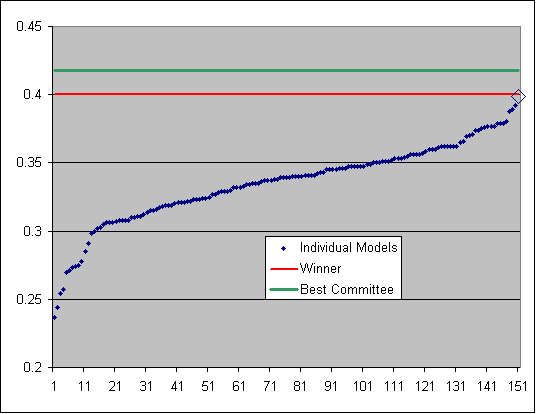
We refined our neural network algorithm to automatically build models on various data sub samples with various settings. What we found was that with committees of 10 models we could consistently get in the top 10 places, but never beat the grand champion winners score. We then combined the 150 individual models created during this process, resulting in a performance exactly equal to that of the grand champion, shown as the diamond on the far right in the plot below. Is this the upper limit for an individual algorithm?
As has been found in the Netflix prize, no matter how much you tweak and squeeze each algorithm, you will reach a plateau in performance. This is basically because a particular algorithm is always looking at the problem from the same perspective. By using different algorithms, the problem is looked at from a different angle and that is where the benefit lies.
If all your experts are taught by the same teacher, then they might have a blinkered view of the situation.
With this particular data, it was the techniques employed to enhance an algorithm rather than the particular algorithm itself that appeared to be the key. At the end of the day, the models were not particularly predictive, which is a feature of the underlying data. The algorithms can only find things if there are things to be found.
So how can I build the best model for my marketing campaign?
What you should do is make you data available in a competition, offering a small prize. Then take the predictions, average them and use them for your campaign.
If you would be happy with just a good model, then we would be more than happy to build one for you.
Related Reading
Competition site
Our submission write up
Dean Abbots blog discussion of the same competition
The Generalisation Paradox of Ensembles by John Elder
Combining Estimators to Improve Performance: Bundling, Bagging, Boosting and Bayesian Model Averaging by John Elder and Greg Ridgeway
Team Bellkor the winners of the first netflix progress prize, used an ensemble of 107 models in their winning solution.
If you know of any links to related articles then please let us know.
Thanks
Thanks to the competition organisers, Nathaniel Noriel for providing the results and especially all the participants.
Dr Phil Brierley - Tiberius Data Mining
3rd July 2007
|